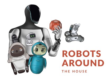
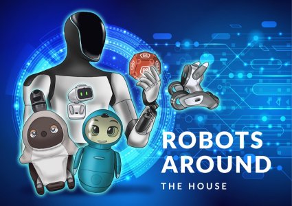
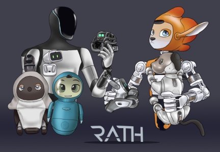
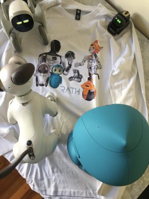
I personally really love the artwork above, especially the one with the blue background - but I really do miss the Loona logo at the top of the forums and as the favicon. Aside from how divided people seem to be about Musk himself, his bot just doesn't hit the same, isn't as relatable to the common person and doesn't look as clean and professional as the previous logo did by far. But that's just my two cents.
Would a hybrid of the two be possible perhaps, with the old Loona logo for the smaller representations and the larger, more detailed artwork for the bigger stuff? Just an idea, but feel free to ignore me too. There are parts that I love of both, and I just personally think the old would compliment the new so nicely in this case.
The simplicity, accessibility (way more people have a Loona robot around their house than an Optimus, for example) and cute factor of the original Loona icon was what initially attracted me to this forum in the first place, actually

